Case Study · End-to-End Product Design, UI Engineering & AI Prototyping
Kova Salud · Redesigning the digital quote around 'Value first, data later'
How we turned a linear 7-step funnel with a 76.4% entry drop-off into a progressive 3-moment experience for individuals, families and companies with a tax ID (NIT).
- Role
- Senior UX/UI Designer & Front-End Prototyper
- Sample analyzed
- 4,250 sessions / 3,180 unique users (30 days)
- Breakpoints
- Responsive mobile-first (375px · 768px · 1440px)
- Stack
- Figma (Variables & Dev Mode), AI prototyping, WCAG 2.1 AA
Step 1 → Step 2
23.6% → 33%–36%
By removing the personal-data wall at the entry
Overall conversion
7.4% → 8.9%–10.4%
+63 to +125 new policies per month with the same traffic
Clicks on disabled button
312 → 0
Active validation with scroll/focus and micro-shake
Load time (LCP)
8.8 s → ≤ 2.5 s
Performance budget, no heavy banner and skeletons <100ms
Demo, deck and files
Explore the 5 sandbox states inside the prototype:
- Happy path
- Empty state
- Skeletons <1s
- Network error with recovery
- Company (NIT) case
Data X-ray: the broken funnel
Legacy 7-step funnel (4,250 sessions · 30 days)
- 1. Entry (name, email, mobile)4,250 sessions · 100.0%
3,247 sessions lost (−76.4%), 82.5% of all site abandonment
- 2. Number of insured1,003 sessions · 23.6%
Retention: 23.6%
- 3. Choose a plan (carousel)828 sessions · 19.5%
Retention 82.6% · drop −17.4%
- 4. Plan details708 sessions · 16.7%
Retention 85.5% · drop −14.5%
- 5. Policyholder details612 sessions · 14.4%
Retention 86.4% · drop −13.6%
- 6. Confirm (health + OTP)302 sessions · 7.1%
Second biggest wound: −50.7% (−310 sessions) from the NIT block and short OTP
- 7. Confirm purchase315 sessions · 7.4%
+4.3% (+13 sessions): anomaly from direct re-entry to checkout after session expiry
Traffic source
48%
organic search: users comparing on mobile, unwilling to share data before seeing a price.
Silent frustration
23.4%
sessions with dead clicks (alert >10%), 13.8% quickbacks and only 1.4% rage clicks. 312 clicks on the disabled 'Quote' button (198 with filled fields, 114 empty) and 64 dead clicks on the banner.
Mobile vs. desktop
61% / 94%
scroll depth (71.8% overall). On the entry page, half of mobile visits never pass 38% and only 7% reach the end.
Performance tax
8.8 s
average LCP (8.4–11.2 s), score 54/100, INP 390 ms and CLS 0.16.
Voice of the customer (CSAT 4.06 / 5 · 76.2% satisfied)
2,500 surveys shown · 1,840 answered
Purchase pain points (n=118)
- Fields that don't validate45
- Slowness31
- Data lost when going back21
- Payment14
- Identity7
Themes among dissatisfied (n=154)
- No human support39
- Too much data35
- Coverage clarity32
- NIT block18
- Slowness14
Analytical rigor: 6 inconsistencies found before designing
- 01
Inverted funnel at checkout
Step 7 has 315 sessions vs. 302 in step 6: OTP session expiry and direct return via payment link.
- 02
Survivorship bias in CSAT
1,040 of the 1,840 answers (56.5%) happened on the entry page, before the real friction.
- 03
Repeated survey triggering
Per-step answers add up to 2,335 (more than the real 1,840); policyholder details has 645 answers for 612 sessions.
- 04
Breakdown based on impressions
Desktop (1,490) + mobile (965) + tablet (45) add up to the 2,500 surveys shown, not the 1,840 answered.
- 05
Mobile under-representation
Weighting scroll depth, 68% of real traffic is mobile, yet 60% of answers came from desktop.
- 06
Forced retries
3,180 unique users generated 4,250 sessions because going back wiped the form.
4 user profiles and prioritization
Mobile-first
Organic explorer
Wants to see the price and what's covered in under 30 s without leaving their phone.
Household
Family planner
Quotes several ages; needs to compare copays and exclusions without carousels or losing data when going back.
Legal entity
Company / SMB with NIT
Needs to identify with a tax ID from step 1, with check-digit validation or hand-off to a corporate advisor.
Support
Prefers human help
Needs 'Call me instead' to save their quote so they don't repeat everything on the phone.
Why prioritize the entry (steps 1–3) and leave step 5/6 for phase 2?
| Criterion | Entry (steps 1 → 3) | Phase 2 (steps 5 → 6) |
|---|---|---|
| Volume | 3,247 sessions lost (82.5% of abandonment) | 310 sessions lost |
| Reach | 100% of traffic (4,250 sessions) | Only 612 surviving sessions |
| Reuse | Inline validation, always-active button, autosave and assisted sales are ready for step 5 | Low upstream impact |
The improvement: 'Value first, data later'
Before
- 7 linear steps
- Data wall before the price
- Plan carousel with dead clicks
- Disabled button with no feedback
- No path for companies (NIT)
After
- 3 progressive moments
- Live price with no contact data
- Clear 3-plan comparator
- Always-actionable button with aria-live
- NIT path with check digit
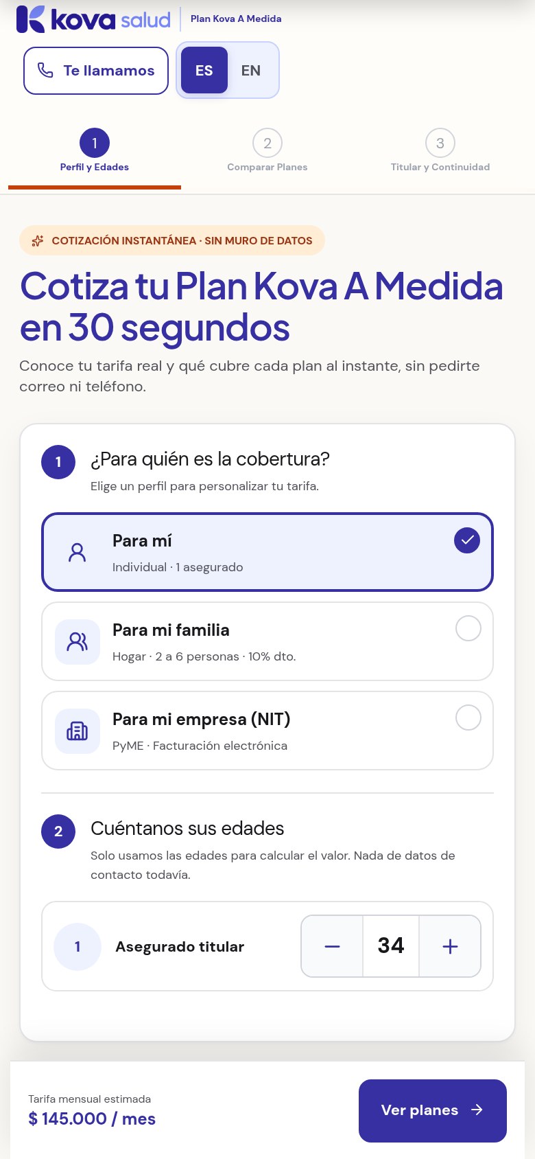
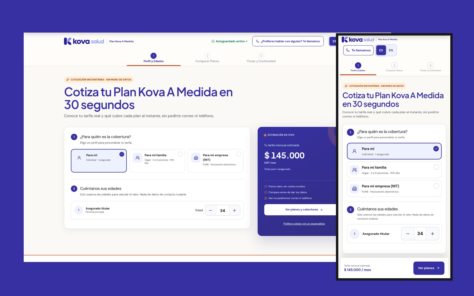
Screen 1
Instant quote with no data wall
One-tap selector (For me / My family / My company NIT), live monthly rate above the fold with just ages, and a button that is never disabled: smooth scroll to the pending field, micro-shake and an aria-live='polite' message.
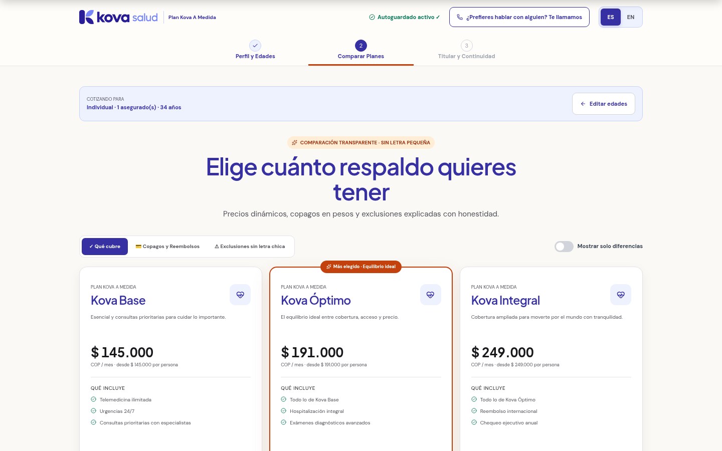
Screen 2
Clear 3-plan comparator
Kova Base, Optimal and Comprehensive. Goodbye carousel: 3 columns on desktop and, on mobile, a sticky segmented control with 'What's covered', 'Copays in pesos' and 'Exclusions, no fine print'.
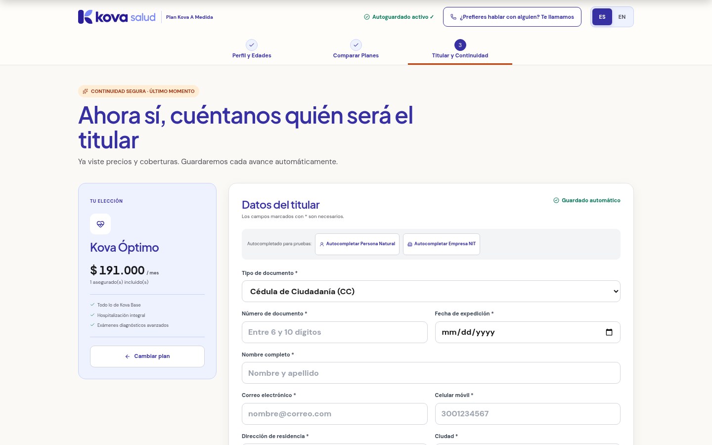
Screen 3
Contextual capture, NIT path and continuity
Only after choosing a plan does it ask for data or email the quote. The form adapts to individuals (CC/CE) or companies (NIT with automatic check digit), autosaves to localStorage, offers a pre-filled assisted-sales drawer and a 3:00 min OTP.
Design system and business impact
Typography: Plus Jakarta Sans + DM Sans · inputs ≥16px on mobile · 44×44px touch targets
| Indicator | Today | Target |
|---|---|---|
| Step 1 → 2 conversion | 23.6% | 33% to 36% |
| Total purchase conversion | 7.4% (315 purchases) | 8.9% to 10.4% (+63 to +125/month) |
| Clicks on disabled CTA | 312 | 0 |
| Sessions with dead clicks | 23.4% | < 10% |
| Quickbacks | 13.8% | < 5% |
| LCP (performance) | 8.8 s | ≤ 2.5 s |
| Time to first price | Up to step 3 | < 30 seconds |
AI judgment (human-in-the-loop) and validation
5 technical and UX corrections I applied manually over the AI output:
- 1Removed the disabled attribute on buttons in favor of active, accessible validation on click.
- 2Adjusted WCAG 2.1 AA contrast on secondary text (#52525B, 5.9:1) and error states.
- 3Standardized inputs to 16px and inputmode='numeric' to avoid forced zoom on iOS Safari.
- 4Added aria-invalid, aria-describedby and aria-live='polite' regions.
- 5Local microcopy: 10-digit mobile numbers starting with 3 and the modulo-11 algorithm for NIT.